David Rodeback's BlogLocal Politics and Culture, National Politics,
|
||
|
|
||
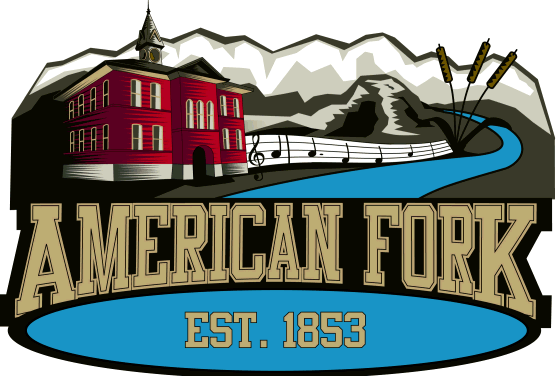
Thursday, December 28, 2006Proposed New Logo for American ForkAmerican Fork City is contemplating a new logo. So far, they like this one best . . . I, your humble blogger, have been swamped lately by Christmas and other adventures, and good blog fodder has been piling up. This includes a proposed new logo for American Fork City. First, the Logo I had hoped to beat the DTM to the punch, but I didn't. Since you can read about the current proposal and the details of its symbolism in Barbara Christiansen's recent article, I won't rehash all that. What I can do is show you the proposed logo in color. (The printed article in the December 21 American Fork Citizen shows it in black and white; the online version of that article doesn't show it at all.) So here it is. Remember that this is a proposal, subject to revision, and not up for a vote yet.
Next, the Council Discussion It's nearly impossible to please everyone, of course. Here are excerpts from unapproved minutes of the December 7, 2006, American Fork City Council meeting. Comments in [brackets] are mine.
Apparently, there will be more discussion of the proposed logo in the City Council work session on January 4, 2007. Then My Own View Your comments on this proposed logo are quite welcome here. As for me . . . I like it. I won't miss the wagon wheel (hub, for "Hub of Northern Utah County"); many communities in the area have some form of that; why be like everyone else? Besides, "Hub of Northern Utah County," strikes me as hollow self-congratulation, if it is not actually damning by faint praise. I'm not an American Fork High School graduate, so I feel no loyalty to -- or, frankly, appreciation of -- the caveman Councilman LeBaron mentioned. I have no beef with the cattails. They are a legitimate representation of the lake and wetlands, which seem poised to become more prominent features of American Fork than they have been, as development (perhaps including a resort) approaches Utah Lake. If someone wants to read into them that they are an endorsement of The Meadows, a large retail development built in and on the wetlands, I am untroubled. If we'll be working at that level of symbolism, why not see the cattails as a mournful pro-environment memorial of what was, before those nasty, capitalist developers came? For that matter, why not complain that City Hall looks too much like a church, even though it is not a church? (On a related topic, note that there is no trace of the LDS temple in the logo, though it draws many people to American Fork and is a prominent visual feature in the city. It will be a sunlit day in outer darkness before such a religious symbol -- especially of the locally dominant Christian religion -- appears in an American Fork City logo. Let's not be pitching slow, hanging curve balls to the ACLU, okay?) Finally, Other Proposals In a bow to American Fork's roots, the logo above was also proposed in a version including a trapper with a fur hat. I have seen this in print, but don't have an electronic version to include here. Fur trapping is not a big part of the local economy these days, so I prefer the logo as above, without the trapper. An much different design was also proposed. It seems to have attracted . . . yawns. It has a stylized American Flag below the words "American Fork" in a large, bold, blue font. Beneath the flag is a partial yellow oval bordering white space that could be used to customize the logo for particular departments. I'm the guy who insists that I am a resident of American Fork, not a citizen of American Fork, because I am in fact a United States citizen. But I yawn at this one, too. Sorry, I don't have it in electronic format, either. David Rodeback comments (12/28/06): If you don't want your comments published at the blog -- which seems to make some folks nervous -- a less-intimidating venue is the forum, which we at the blog are pleased to call "The Water Cooler." (Links here lead straight to a topic on the new logo.) Mark Steele comments (12/29/06): Like a couple of council members, I'd also like the city hall to be more accurate, less stylized. What does the music represent? It's been a long time since we were famous for the arts festival. And what kind of meter has 4.5 beats to a measure? I'll have to try and play the notes when I get home to see what they sound like. Maybe they are the first notes of the AF High song; that would solve Shirl's request to have some reference to AF High. David Rodeback replies (12/29/06): Per Barbara Christiansen's article, referenced above, quoting Debby Lauret, the City's Economic Development Director: "American Fork has been well known for its marching band, symphony and the Crescent School of Music," [Lauret] said. There are a couple of bars of musical notes, the beginning of "America the Beautiful." As to the notes themselves, good eye! The third note should be an eighth note; then it's 4/4 time. They should give you an award or something. David Rodeback comments (1/2/2006): Councilman LeBaron writes that he doesn't really want a caveman in the logo. Mentioning it was "a lame attempt at neanderthal humor." Whew.
Copyright 2006 by David Rodeback. |
||